Weight Watchers
Weight Watchers was going through a significant shift, moving from a traditional points-based programme toward a broader, medically supported health platform. The mobile app and website needed to keep up with that change without leaving behind the users who'd been with WW for years.
ROLE
PROBLEM
The app was showing its age, both visually and structurally. Accessibility gaps were causing real problems for users, and the product wasn't built to handle the complexity of medical weight loss journeys alongside the classic WW experience. Users were dropping off, and the gap between where the brand was heading and what the product offered was growing.
RESULTS
Accessibility compliance improved meaningfully after a full WCAG 2.1 audit.
The design system was rebuilt to support both existing and new health journeys without fragmenting the experience.
Usability testing across 20+ sessions shaped decisions throughout, not just at the end.
Flexible system ready to evolve with future health programs.
The Challenge
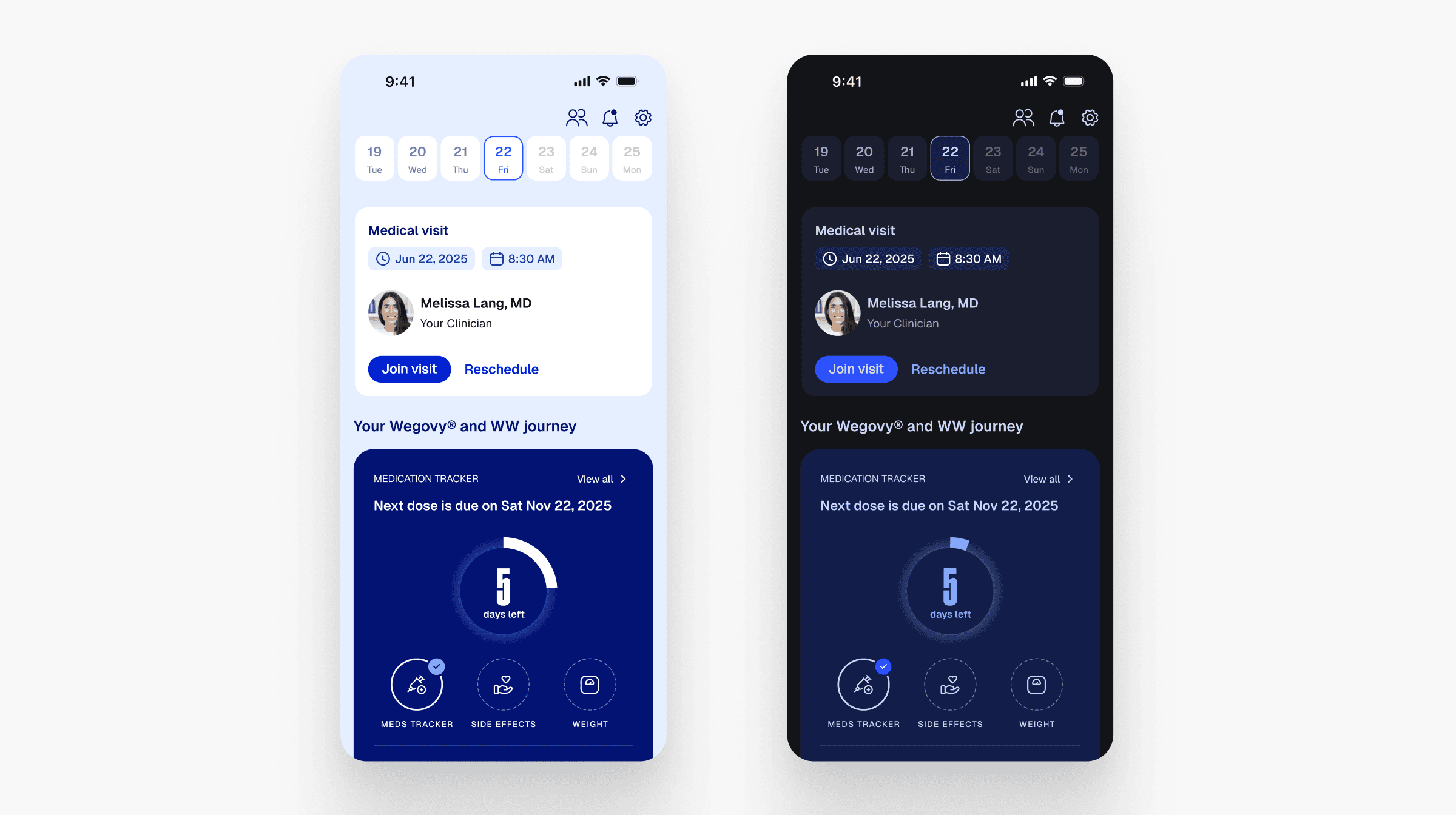
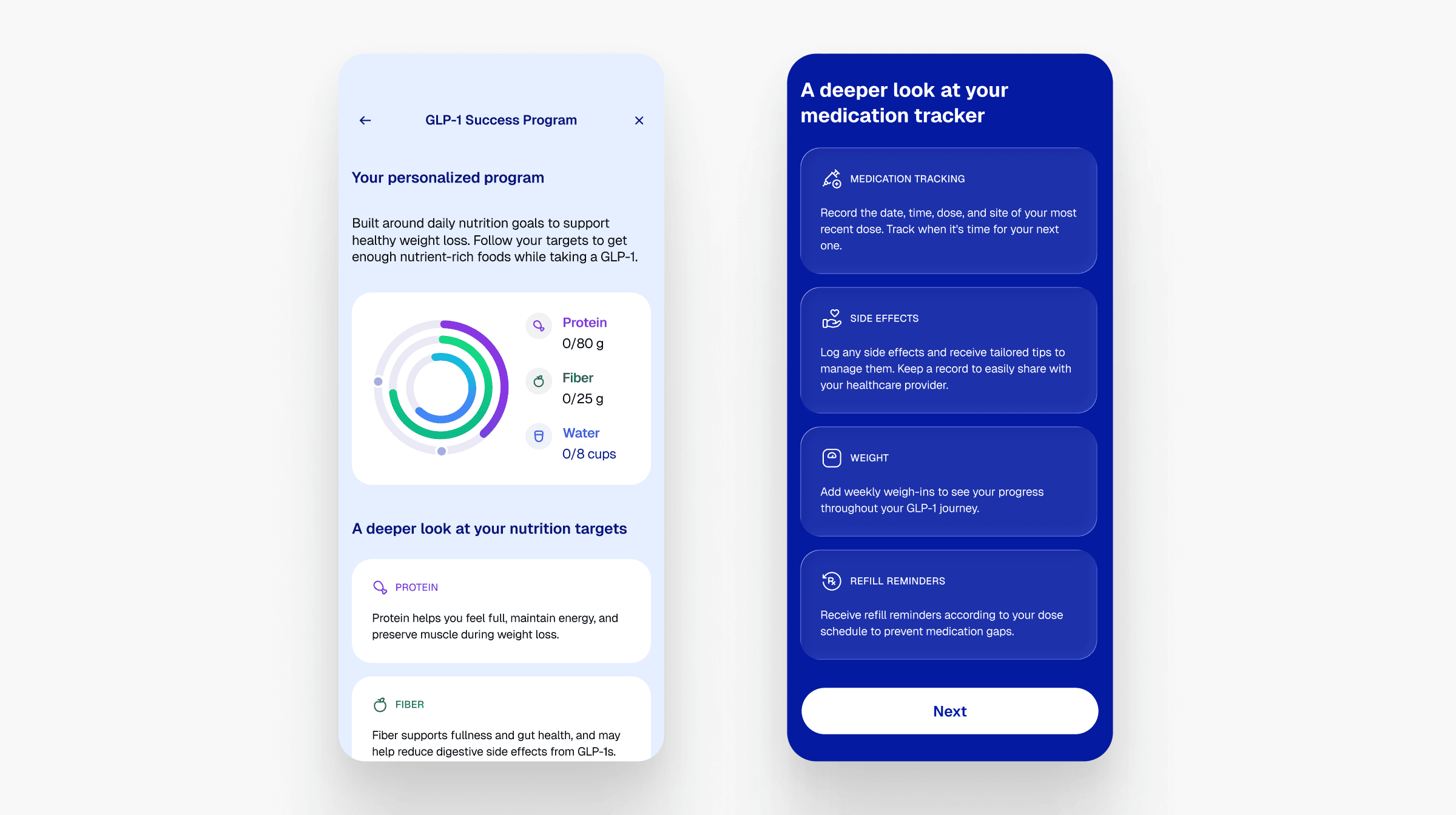
WW's move into medical weight loss, including GLP-1 medication support, added a layer of complexity the app wasn't designed for. The product now needed to serve users with very different goals: some tracking Points like they always had, others managing medication schedules and side effects. The existing app struggled to hold all of that together.
On top of that, it had real accessibility problems that were affecting real users, and a design system that had fallen behind the new brand direction.

My Role & Approach
My work covered the mobile experience across iOS and Android, with a focus on three areas: accessibility, the design system, and the health journey flows.
On accessibility, I ran a full WCAG 2.1 audit and worked with engineering to close the gaps. It wasn't a one-off review. It changed how the team thought about contrast, touch targets, and content hierarchy going forward.
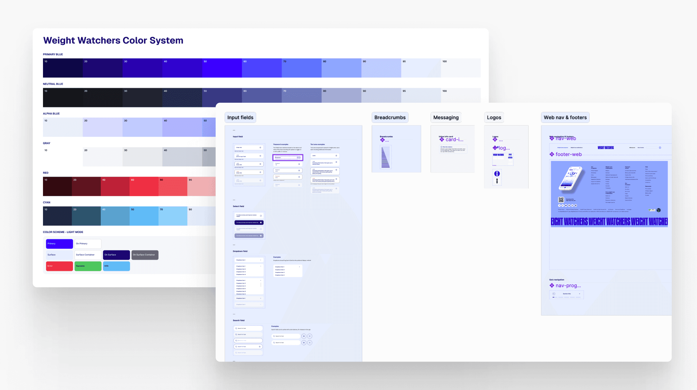
For the design system, I rebuilt it using a multi-tier variable structure (primitive, semantic, component) and shipped dark mode support across all surfaces. The goal was something the team could grow with rather than constantly patch.
The health journeys were probably the most involved part. Designing for someone tracking GLP-1 dosing and side effects is quite different from designing for someone logging meals. I had to make both feel coherent within a single product without one experience undermining the other. I ran 20+ usability and accessibility sessions throughout, which meant findings shaped decisions in real time rather than arriving too late to act on.


Outcome
The app came out the other side with a stronger accessibility foundation, a design system that could actually scale, and flows that worked for the full range of users WW was now serving. It wasn't just a visual update, it was the product catching up with where the brand was already heading.